When we see a headline about an aviation incident, it’s easy to feel a sense of alarm. However, headlines are snapshots, while data is the full movie.
In this project, I analyzed over two decades of NTSB (National Transportation Safety Board) records, focusing on large-scale operators to answer two fundamental questions: Which aircraft appear most frequently in the safety logs, and is the human cost of flying decreasing over time?
Who shows up the most? (The Treemap)
First, I wanted to see which aircraft models dominate the safety records, so I used a Treemap because it helps us compare the relative number of incidents across aircraft models at a glance.
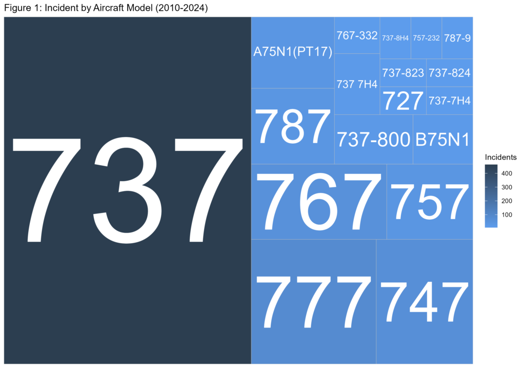
Observation: As the treemap shows, the Boeing 737 and 777 models occupy the largest space. However, it is vital to put this in context: These aircraft are some of the most widely used commercial planes in the world, logging millions of flight hours every year. Their presence in the data is a reflection of their popularity, not necessarily a lack of safety. By visualizing this as a treemap, we can see how the aviation business is made up of hundreds of smaller models that rarely make the news.
Timing, Trends, and What They Reveal (The Timeline)
Volume alone doesn’t tell the story. To understand whether aviation is getting safer, we need to look at the trends over time. By mapping total incidents against annual fatalities from 2010 to 2024, we see the true story of modern aviation.
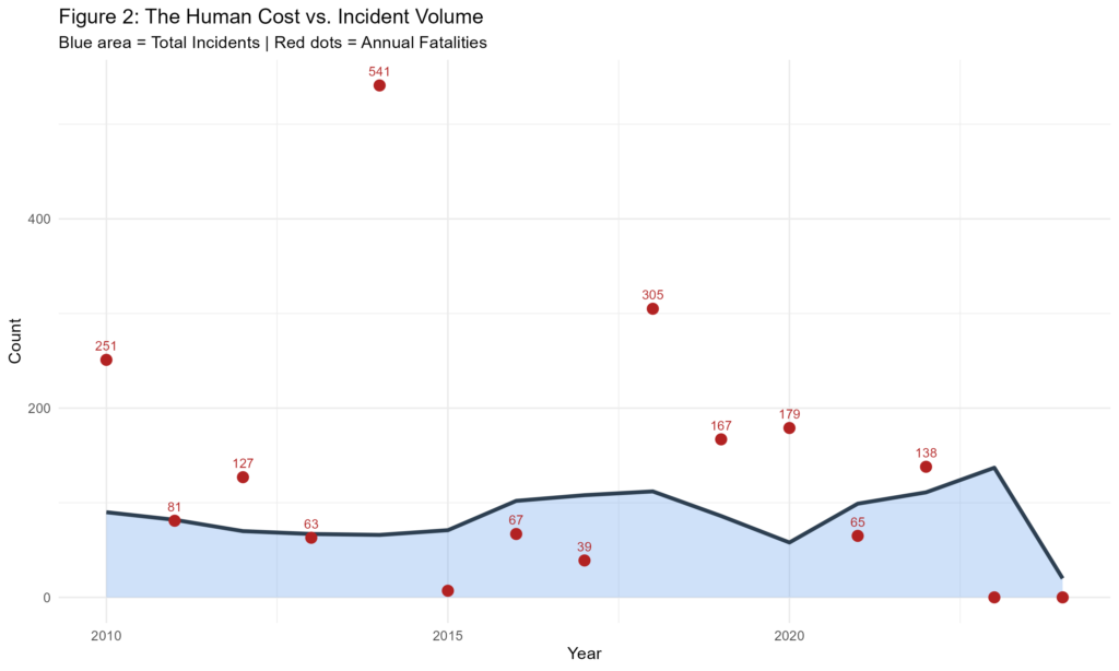
Observation: While the “baseline” of minor incidents (the blue area) remains relatively steady, the fatal events (red markers) do not follow the same path. This divergence shows that while incidents happen, they are increasingly survivable. Improvements in aircraft design, pilot training, emergency response, and safety systems mean that when things go wrong, the outcome is very different than it once was.
Modern aviation isn’t just about preventing accidents; it’s about making sure people walk away from them.
Curious about the data behind the charts? Below is the full R script used to process the NTSB records and generate these visualizations. You can copy this into your own environment to reproduce the analysis.
# PROJECT: Aviation Safety Analysis (2010-2024)
# AUTHOR: [Tobi/tobiadenola.com]
# PURPOSE: Processing NTSB incident data for volume and severity trends.

# Load needed libraries
library(tidyverse)
library(treemapify) # For creating ggplot2 treemaps

# Load the NTSB Data
aviation_data <- read.csv("C:/Users/USER/Downloads/aviation_data.csv",
                          stringsAsFactors = FALSE)

# Cleaning the data by creating a column with Eventdate converted to proper datetime object and removing white space characters
clean_aviation <- aviation_data %>%
  mutate(
    Year = lubridate::year(as.POSIXct(EventDate, format = "%Y-%m-%dT%H:%M:%SZ")),
    Model = toupper(trimws(Model))
  ) %>%
  filter(Year >= 2010) # # Filter data for the last decade starting from 2010

# Treemap object
treemap_data <- clean_aviation %>%
  group_by(Model) %>%
  summarise(Incidents = n()) %>%
  slice_max(Incidents, n = 15)

# Treemap showing aircraft models frequent in the NTBS record
ggplot(treemap_data, aes(area = Incidents, fill = Incidents, label = Model)) +
  geom_treemap() +
  geom_treemap_text(colour = "white", place = "centre", grow = TRUE) +
  scale_fill_gradient(low = "#5D9CEC", high = "#2C3E50") + # Blue Theme I found on Flat UI colors
  labs(title = "Figure 1: Incident by Aircraft Model (2010-2024)") +
  theme_minimal()

# To save Image of the treemap
ggsave(
  filename = "aviation_treemap.png",
  width = 10,           # Width in inches
  height = 7,           # Height in inches
  dpi = 300,            # High resolution (Standard for web/print)
  device = "png"        # Format
)

# Summarize data by year
timeline_data <- clean_aviation %>%
  group_by(Year) %>%
  summarise(
    Total_Incidents = n(),
    Fatalities = sum(FatalInjuryCount, na.rm = TRUE),
    Serious_Injuries = sum(SeriousInjuryCount, na.rm = TRUE)
  ) %>%
  filter(!is.na(Year))

# Area plots to show the fatlities and the total incidents from 2010
ggplot(timeline_data, aes(x = Year)) +
  # Fill the area under the incidents to show volume
  geom_area(aes(y = Total_Incidents), fill = "#5D9CEC", alpha = 0.3) +
  geom_line(aes(y = Total_Incidents), color = "#2C3E50", size = 1.2) +
  # Add points for Fatalities to show severity peaks
  geom_point(aes(y = Fatalities), color = "firebrick", size = 3) +
  geom_text(aes(y = Fatalities, label = ifelse(Fatalities > 10, Fatalities, "")),
            vjust = -1, size = 3, color = "firebrick") +
  labs(
    title = "Figure 2: The Human Cost vs. Incident Volume",
    subtitle = "Blue area = Total Incidents | Red dots = Annual Fatalities",
    y = "Count",
    x = "Year"
  ) +
  theme_minimal()

# To save the Image showing the timeline
ggsave(
  filename = "aviation_timeline.png",
  width = 10,
  height = 6,
  dpi = 300
)
Data Accessibility
The data used in this post are publicly available from the National Transportation Safety Board (NTSB) NTSB CAROL Database. Download the raw NTBS dataset here
Leave a Reply