A Staggering Daily Reality
I was scrolling through X and came across a map posted by data scientist Samuel Sinyangwe. The data from Mapping Police Violence presented a troubling statistic: in 2025, police in the U.S. killed an average of 3 people per day.
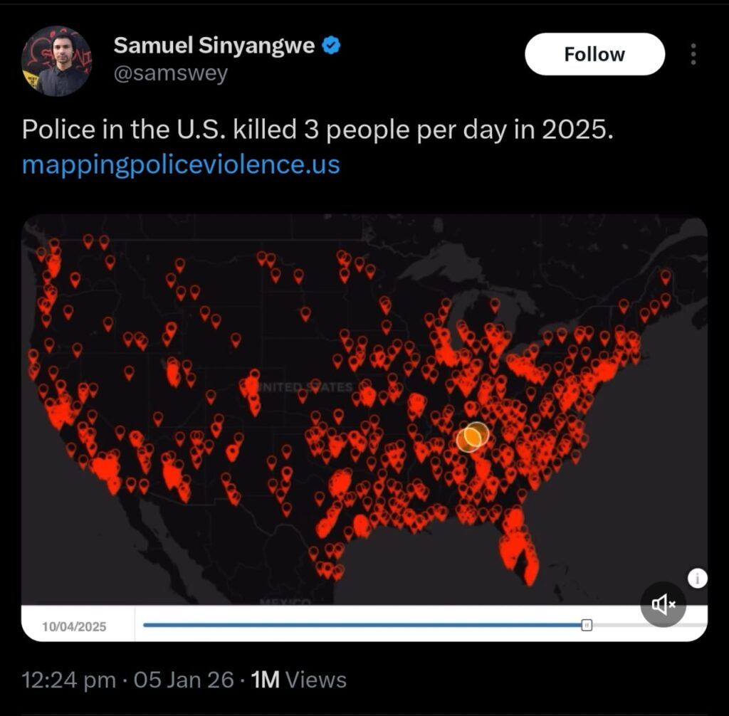
Link to Samuel Sinyangwe’s Tweet
This map prompted me to download the raw dataset and dig deeper to know if this shows a new spike or a long-term systemic pattern.
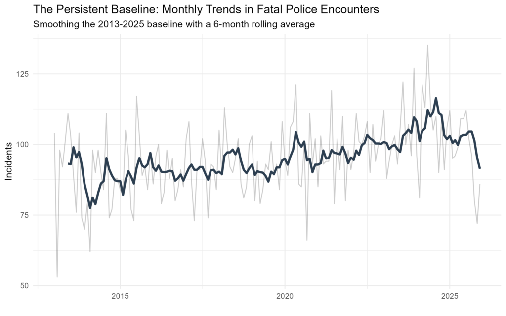
Tracking the Long-Term Trend
When we look at the raw monthly data from 2013 through 2025, the volatility is clear. However, by applying a 6-month rolling average to look past short-term noise, we can see the underlying trend. While many expected to see a significant downward trend following national policy discussions in 2020, the data shows that the frequency of these incidents has remained remarkably consistent, showing a high and steady baseline through 2025.
Demographic Divergence: Looking Beneath the Surface
Aggregate trends often hide the most important details. By breaking down the data by White, Black, and Hispanic demographics, we see that the “national trend” is actually composed of very different realities. Using “free” vertical scales on our charts reveals that the relative risk and the frequency of these encounters shift differently for each group over time.
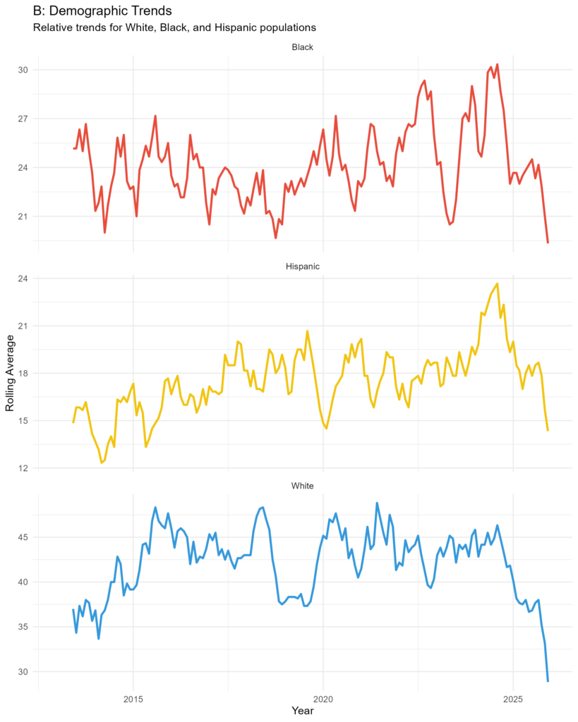
The 2025 Reality
Based on the most recent data from 2025, the burden of these encounters remains largely unchanged from the patterns identified over a decade ago.
Snapshot of 2025:
- White individuals accounted for 40.5% of cases.
- Black individuals accounted for 28.7% of cases.
- Hispanic individuals accounted for 21.3% of cases.
- Approximately 9.5% of incidents remain classified as “Other/Unknown race,” highlighting a persistent gap in immediate transparency and reporting.
The raw data for this analysis were sourced from the Mapping Police Violence Database
For those interested in the technical side, I did this analysis in R using the tidyverse, lubridate, and zoo packages. Below is the full script used for data cleaning and visualization.
# To load R libraries needed
library(tidyverse)
library(lubridate)
library(janitor)
library(zoo)

# To load the data
policekillings <- read_csv("C:/Users/USER/Documents/Tobis Website/PoliceKillings_2013_2025/police_killings.csv")

# Cleaned the data. There were spaces between the column names so I fixed that and standardized the date format because I was still going to round it down to month
policekillingsnew <- policekillings %>%
  clean_names() %>%
  mutate(newdate = mdy(date_of_incident_month_day_year)) %>%
  filter(!is.na(newdate))

# Created new columns so that we have three (known) race and other/unknown as in the dataset
policekillingsbyrace <- policekillingsnew %>%
  mutate(race_group = if_else(victims_race == "White", "White",
                              if_else(victims_race == "Black", "Black",
                                      if_else(victims_race == "Hispanic", "Hispanic", "Other/Unknown")
                              )
  )
  )

# Analysis of the overall trend
overall_trend <- policekillingsbyrace %>%
  mutate(monthandyear = floor_date(newdate, "month")) %>%
  count(monthandyear) %>%
  mutate(rolling_average = rollmean(n, k = 6, fill = NA, align = "right"))

# The plot for the overall trend
plot_a <- ggplot(overall_trend, aes(x = monthandyear)) + # Fixed x variable name
  geom_line(aes(y = n), alpha = 0.2, size = 0.5) +
  geom_line(aes(y = rolling_average), color = "#2c3e50", size = 1.2) +
  labs(title = "The Persistent Baseline: Monthly Trends in Fatal Police Encounters",
       subtitle = "Smoothing the 2013-2025 baseline with a 6-month rolling average",
       y = "Incidents", x = "") +
  theme_minimal()

# Trend by race
trendbyrace <- policekillingsbyrace %>%
  filter(race_group != "Other/Unknown") %>%
  mutate(monthandyear = floor_date(newdate, "month")) %>% # Synchronized date name
  count(monthandyear, race_group) %>%
  group_by(race_group) %>%
  mutate(rolling_average = rollmean(n, k = 6, fill = NA, align = "right"))

# Plot showing the trend by race
plot_b <- ggplot(trendbyrace, aes(x = monthandyear, y = rolling_average, color = race_group)) + # Fixed dataframe name
  geom_line(size = 1) +
  facet_wrap(~race_group, ncol = 1, scales = "free_y") +
  scale_color_manual(values = c("Black" = "#e74c3c", "Hispanic" = "#f1c40f", "White" = "#3498db")) +
  labs(title = "B: Demographic Trends",
       subtitle = "Relative trends for White, Black, and Hispanic populations",
       y = "Rolling Average", x = "Year") +
  theme_minimal() +
  theme(legend.position = "none")

# To save the first plot
ggsave("national_pulse.png", plot = plot_a, width = 8, height = 5, dpi = 300)

# To save the second plot
ggsave("demographic_divergence.png", plot = plot_b, width = 8, height = 10, dpi = 300)


#Table summarizing the final numbers behind the map
data2025 <- policekillingsbyrace %>%
  filter(year(newdate) == 2025) %>%
  count(race_group) %>%
  mutate(percentage = round(n / sum(n) * 100, 1)) %>%
  arrange(desc(percentage))

print(data2025) #To show the table
Leave a Reply